Hirun D. Kalhara

Back home

My Projects

A selection of logos, brands, labels, websites, systems and campaigns, each with the goal behind it and the thinking that shaped the design.

Logo Design

Flavor LK

(Importer Logo Design)

Project goal:

Design a warm, premium logo for Flavor LK Importers (Pvt) Ltd that reads clearly on shop signage, business cards and social posts.

Design decision:

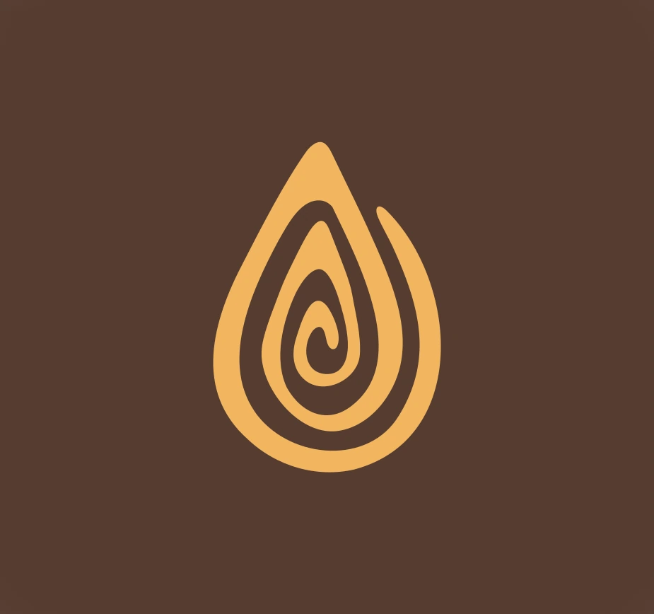
A single drop with a swirl inside suggests rich, melting flavour in one simple shape. Deep cocoa brown with caramel gold, and wide Barlow lettering, keep the mark warm, premium and easy to read at any size.
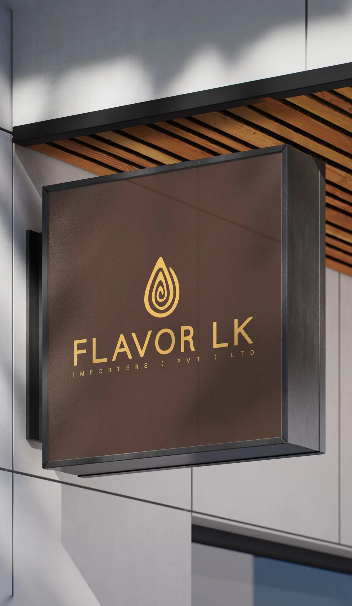
Flavor LK logo on a shop sign
Flavor LK drop mark
Flavor LK logo on a coffee background
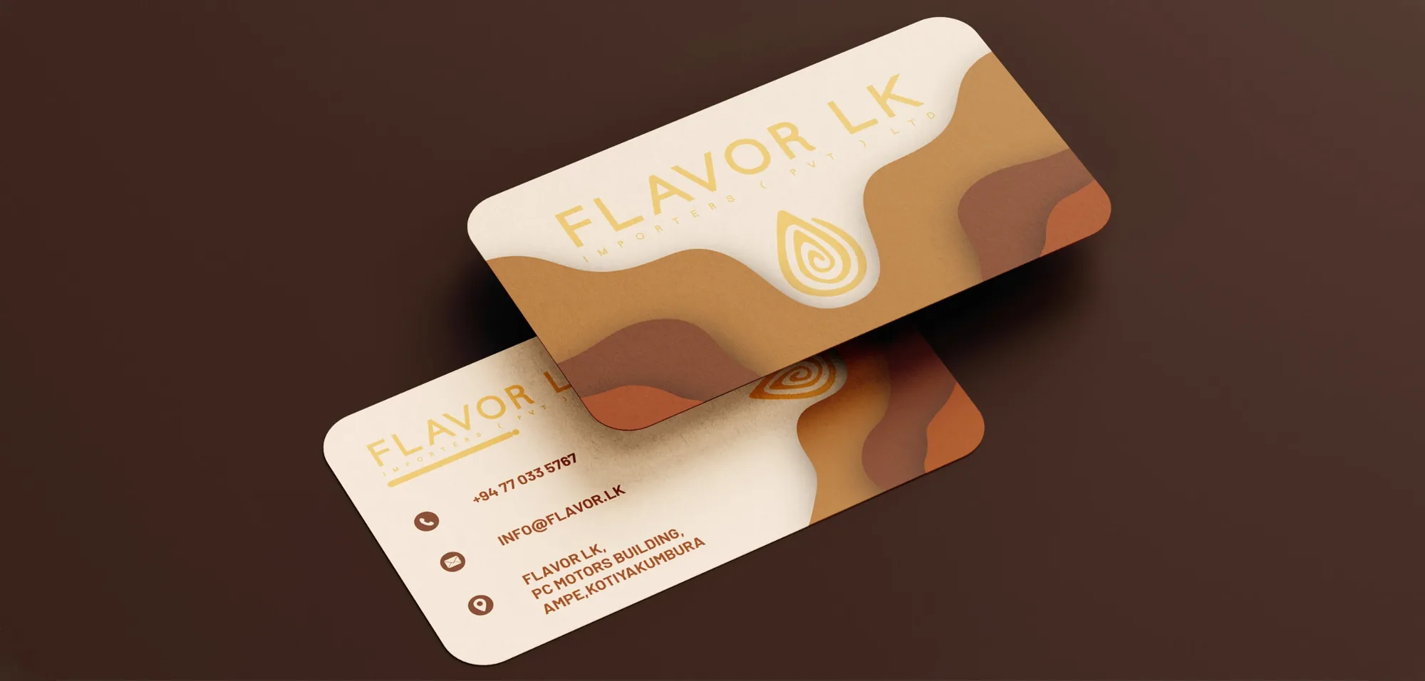
Flavor LK business cards
TypographyBarlowBoldAa
Cocoa#553C31Caramel#F2B65FWhite#FFFFFF

Gov Slow

(App Logo Design)

Project goal:

Create a friendly, easy-to-spot logo for the Gov Slow app that works as a home-screen icon and as a full wordmark.

Design decision:

Two round eyes and a small smile make a calm, patient face that is easy to remember. Bright blue with deep navy, and bold Barlow lettering, keep the logo clear and readable, even at app-icon size.
Gov Slow logo, stacked
Gov Slow logo, horizontal
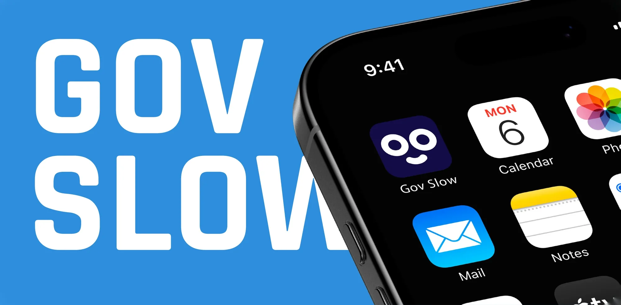
Gov Slow app icon on a phone home screen
Gov Slow app icon with wordmark
Navy#130C47Blue#0071F8White#FFFFFF
TypographyBarlowBoldAa

Timcote

(Education Logo Rebrand)

Project goal:

Refresh the Timcote logo so the education brand looks modern and confident, and stays clear on dark backgrounds, signage and social media.

Design decision:

A graduation cap over an open book shows learning at a glance, with a hand on the page for a hands-on, human feel. Bold red on black, with rounded Moonet lettering, gives the brand energy while keeping it simple to reproduce.
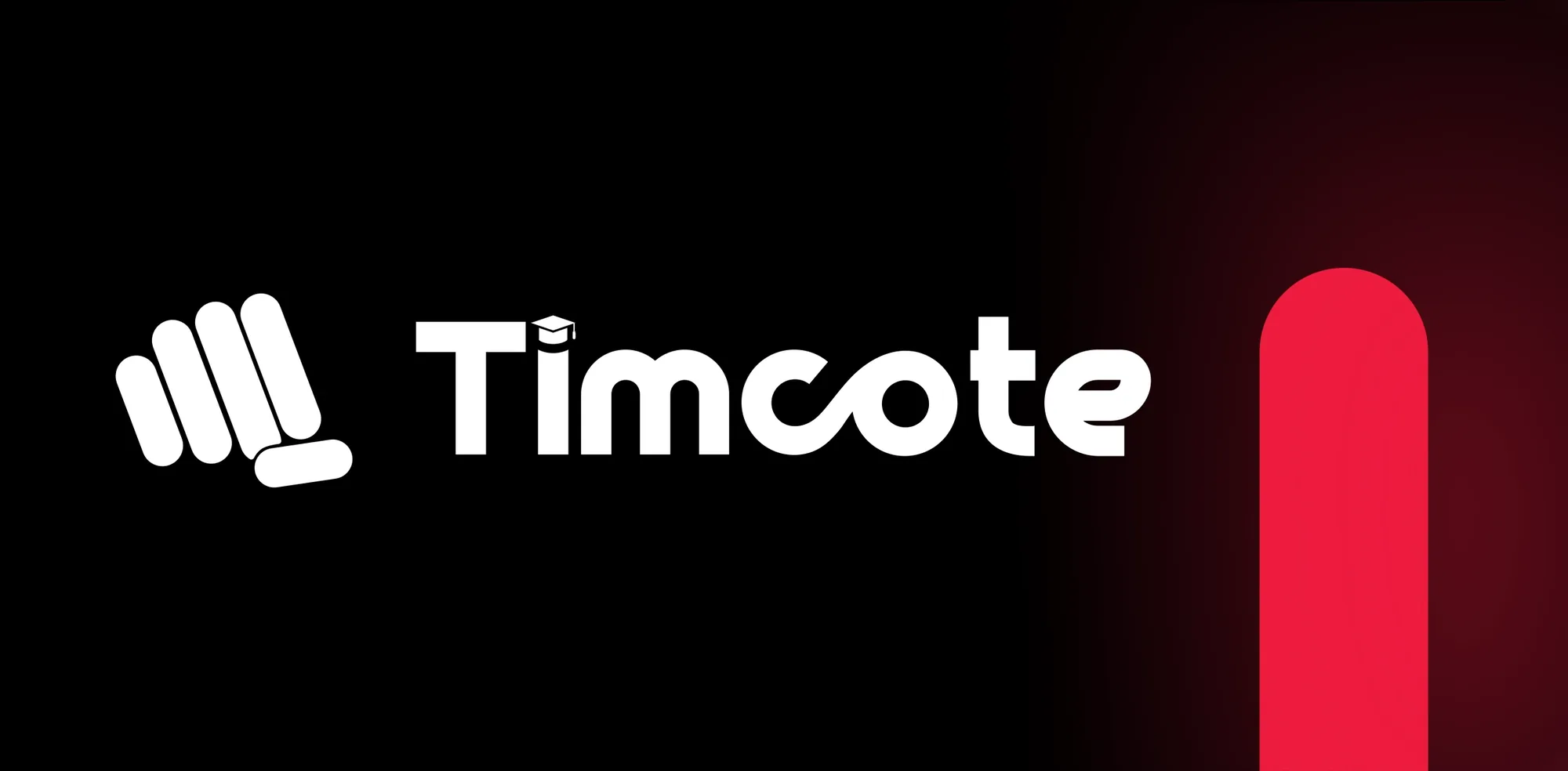
Timcote logo, stacked
Timcote book and cap mark
Timcote logo, horizontal
Timcote hand mark with wordmark
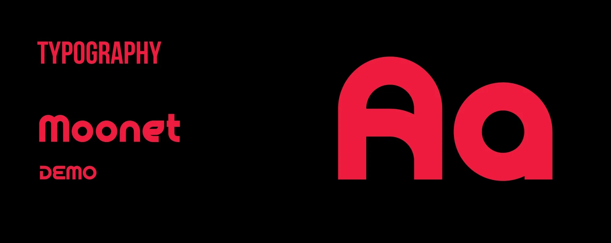
Timcote typography: Moonet
Red#ED1B3EBlack#0F0F0FWhite#FFFFFF

Branding

Yōkai Burgers

(Burger Restaurant Branding)

Project goal:

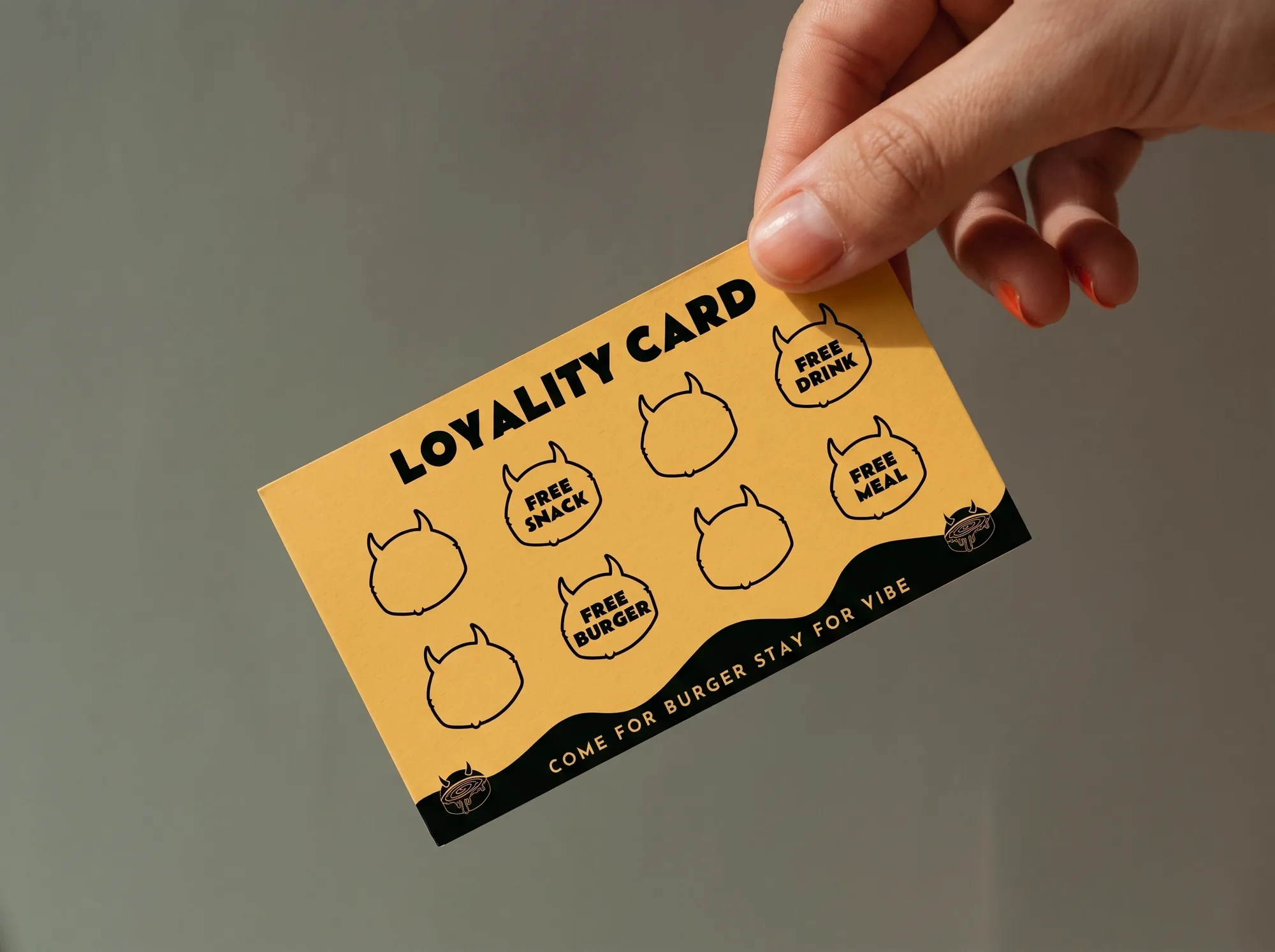
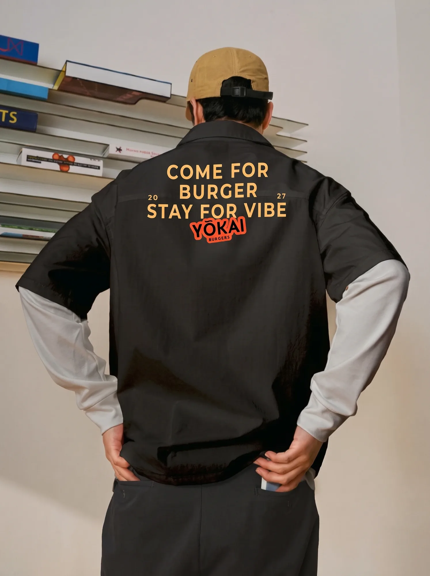
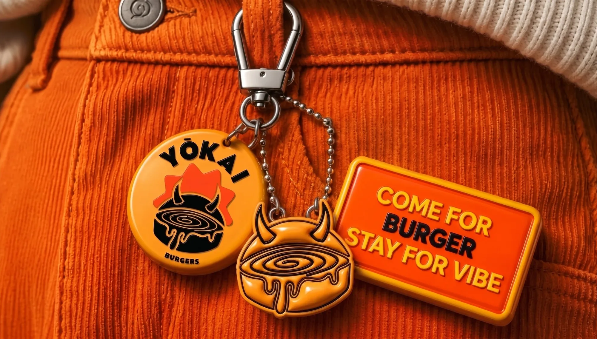
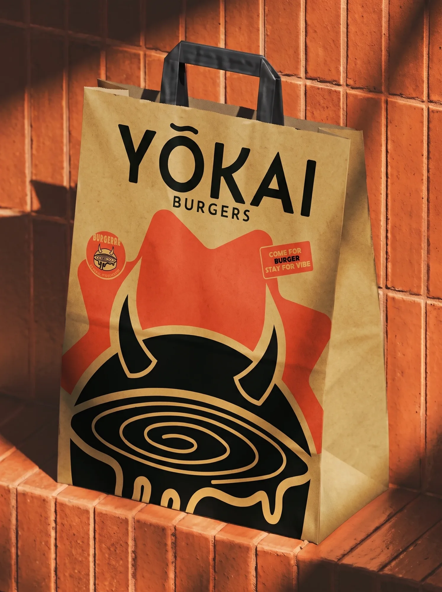
Create a loud, memorable identity for a burger joint that people want to wear, collect and share, across stickers, bags, staff shirts, merch and a loyalty card.
Design decision:

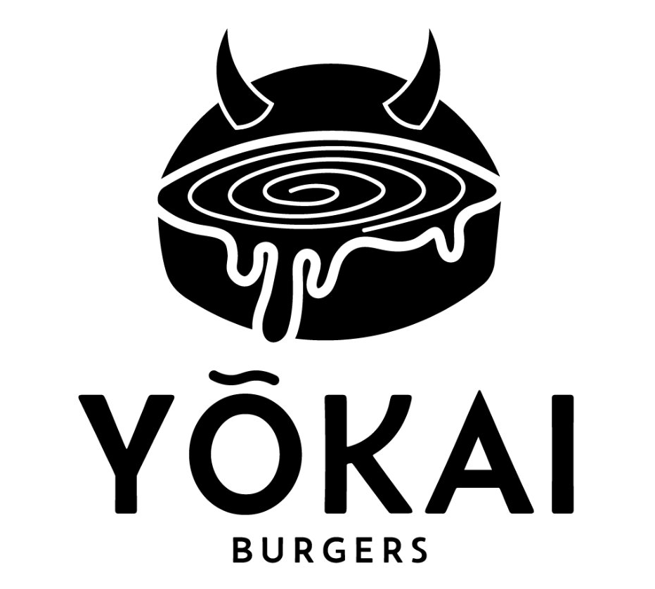
A horned burger with a swirl of melting cheese turns the yōkai, a mischievous spirit from Japanese folklore, into a mark that feels playful and a little wicked. Warm yellow, flame orange and black keep every piece bold and appetising, and the “Come for burger, stay for vibe” line carries the attitude onto merch.

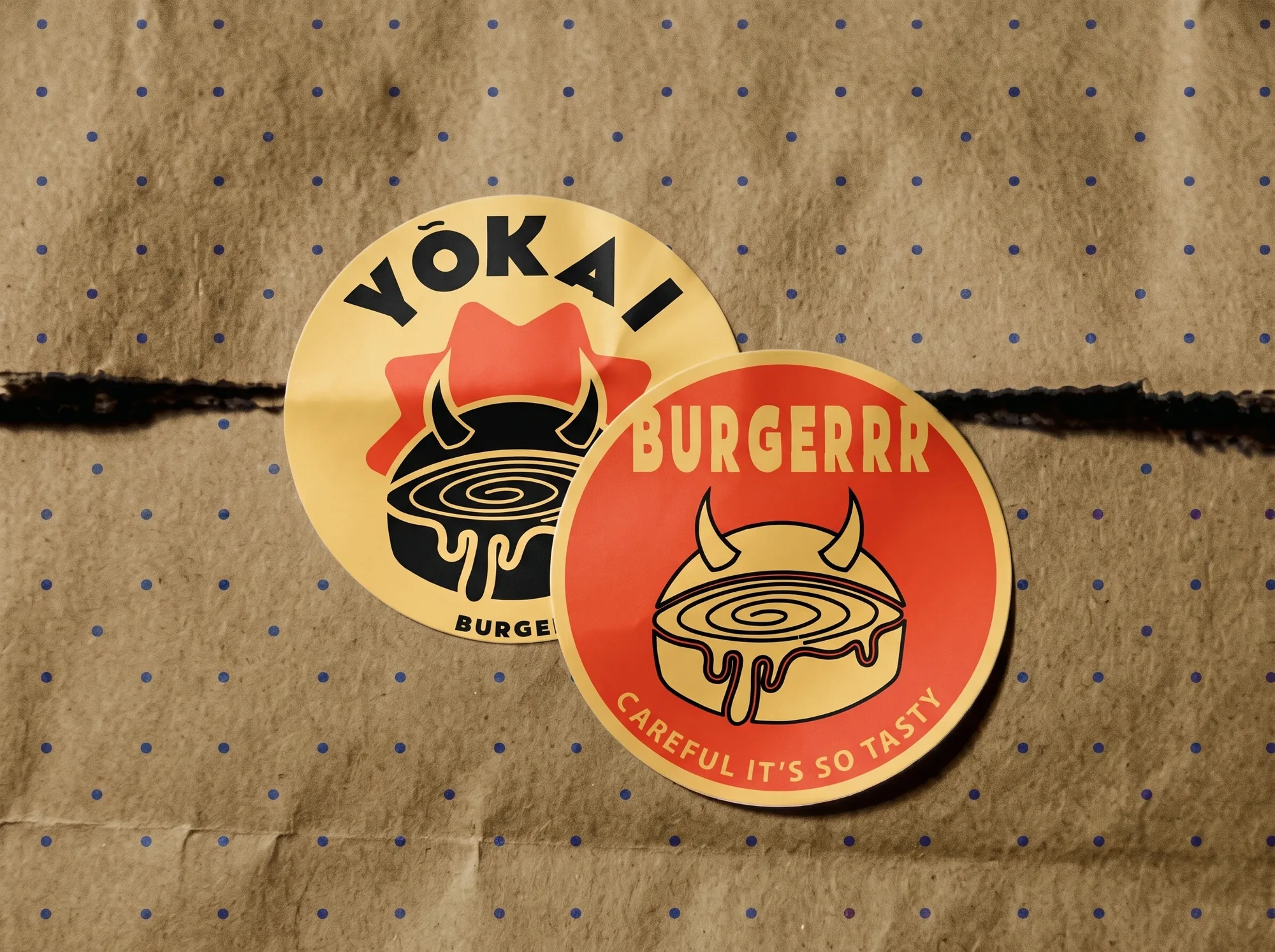
Yōkai Burgers stickers on a paper bag
Yōkai Burgers loyalty card
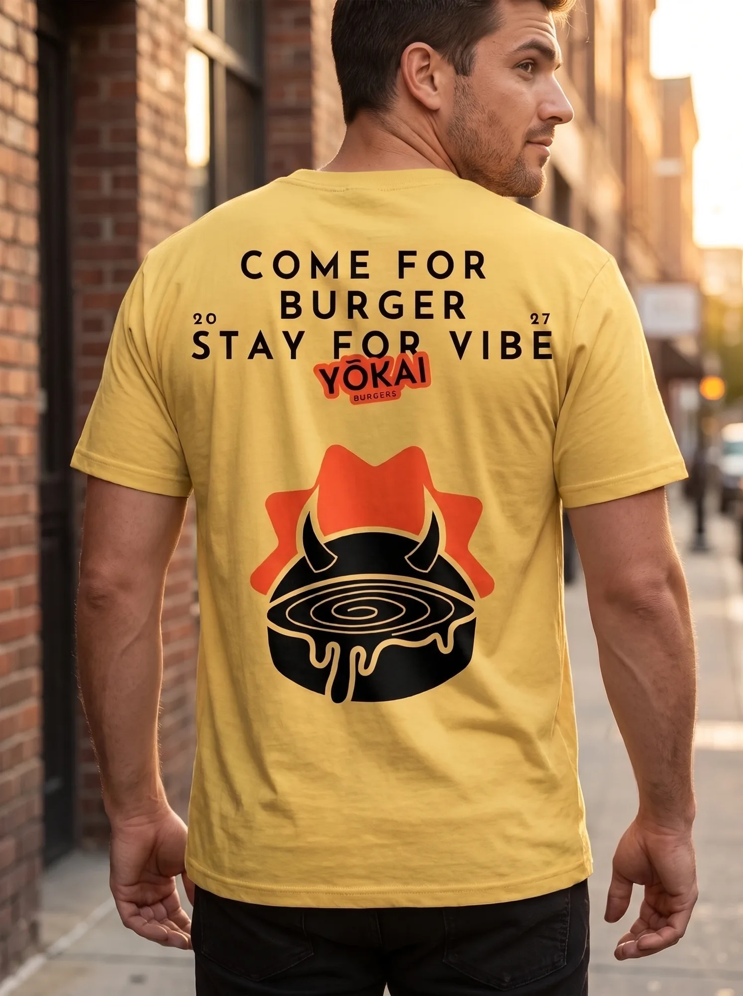
Staff shirt with the Come for burger, stay for vibe print
AaBelanosimaABCDabcdBelanosima12345678!@#$%
Flame#FC4E2BInk#000000Bun#FFFFFF
Yōkai Burgers keychains on orange corduroy
Yōkai Burgers paper takeaway bag
Yellow Yōkai Burgers T-shirt, back print
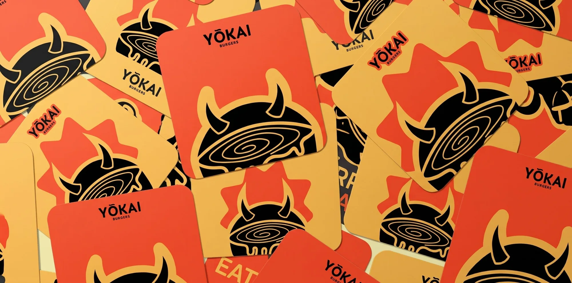
Scattered Yōkai Burgers cards
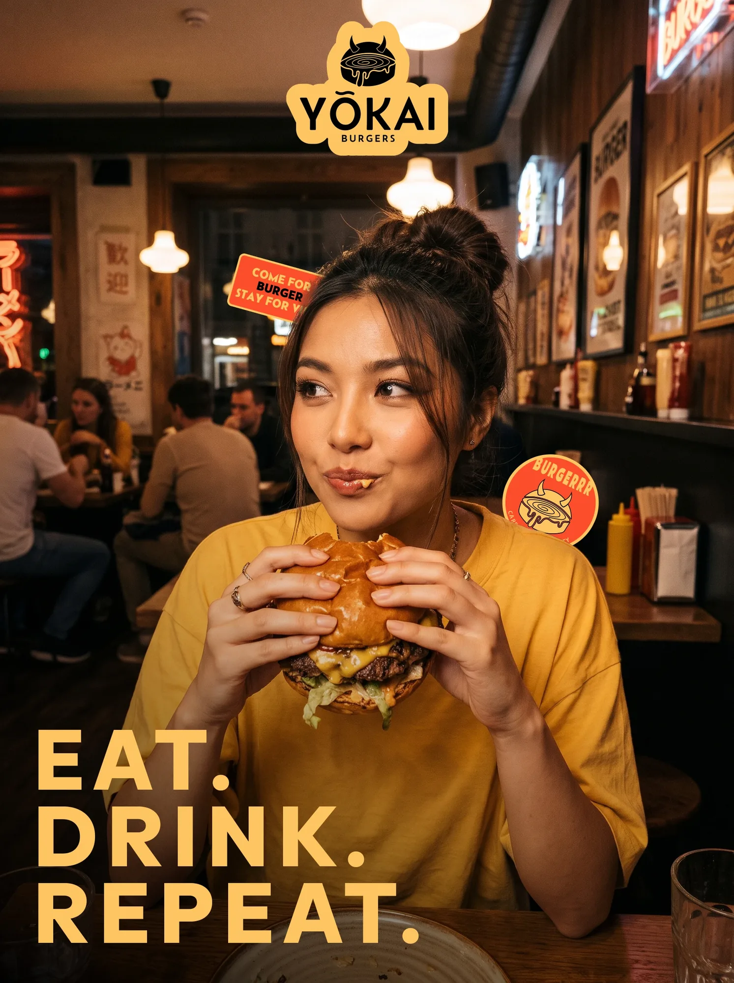
Eat. Drink. Repeat. poster for Yōkai Burgers

Ceylona

(Travel Brand Identity)

Project goal:

Build a complete identity for Ceylona, a tailor-made travel company in Sri Lanka, that feels premium and welcoming across the website, social ads, merch and travel accessories.

Design decision:

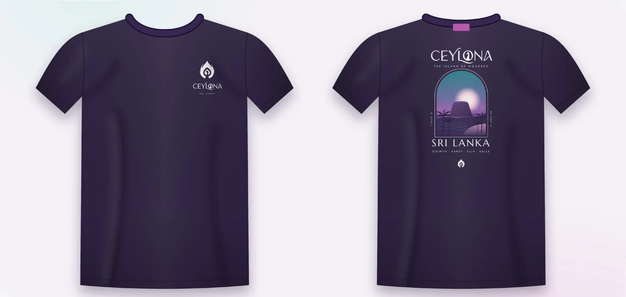
A peacock tucked inside a flame-like feather becomes the mark, and returns inside the “O” of the wordmark. A teal-to-magenta gradient on deep plum gives every touchpoint a sunset glow, and the Sigiriya arch carries the story from the homepage to T-shirts and wristbands.

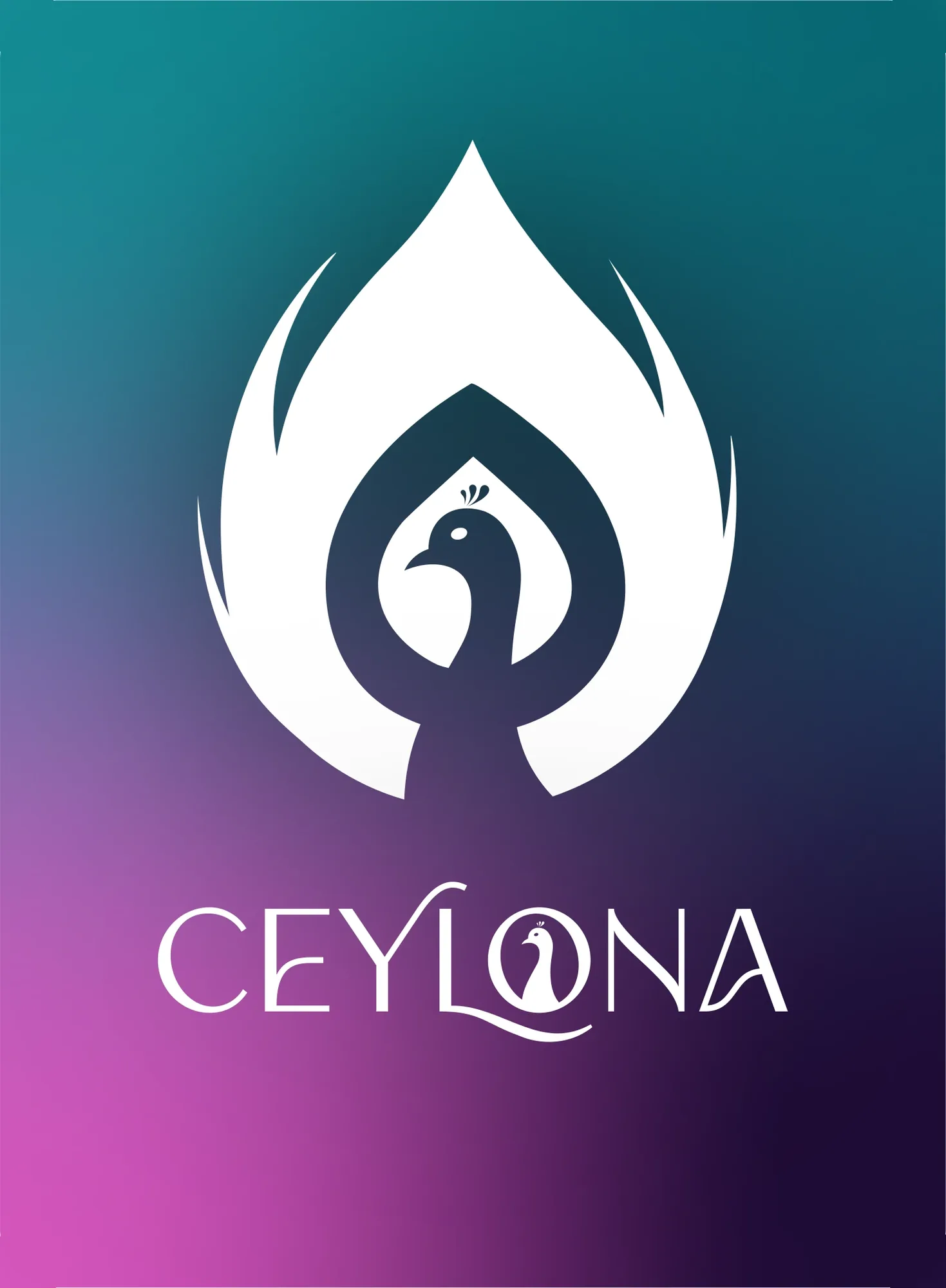
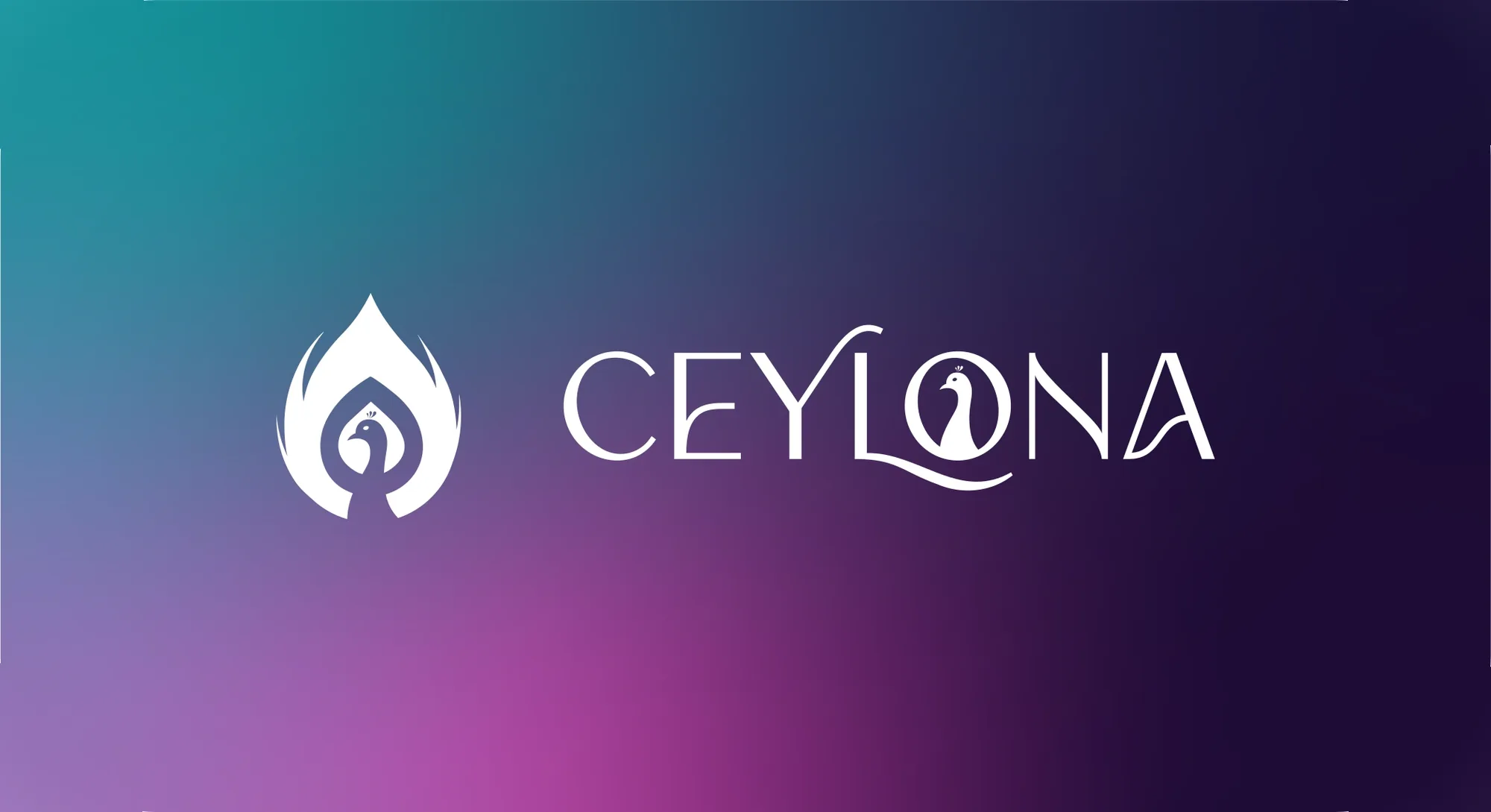
Ceylona logo, stacked
Ceylona logo, horizontal
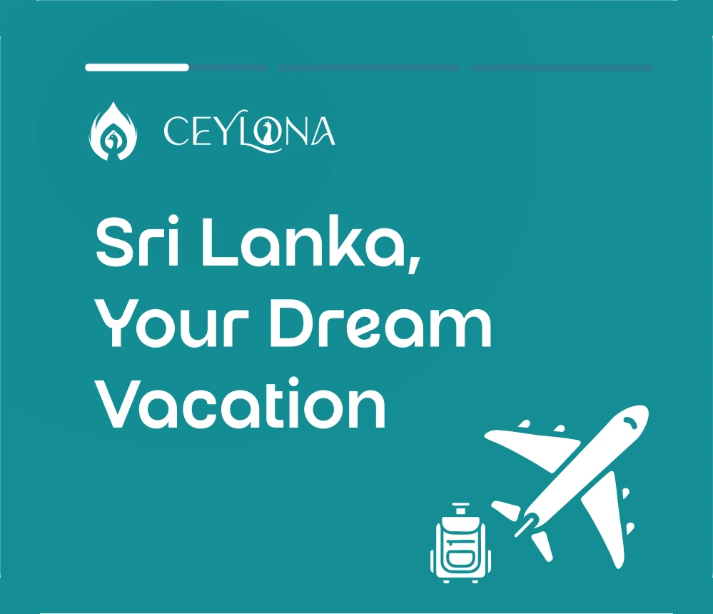
Sri Lanka, Your Dream Vacation card
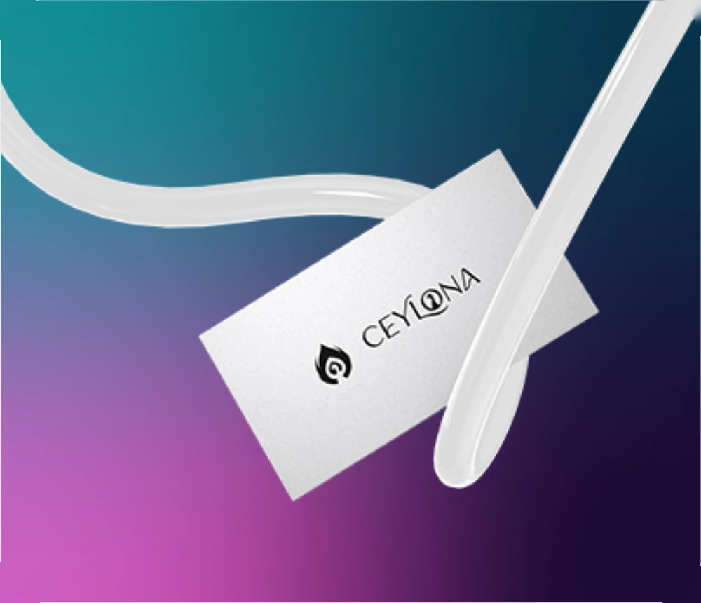
Ceylona luggage tag
Teal#138D94Orchid#C85DBDPlum#1F0C36
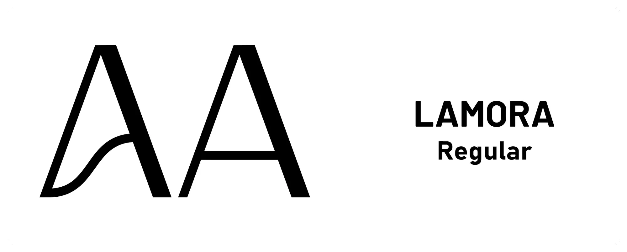
Ceylona typography: Lamora Regular
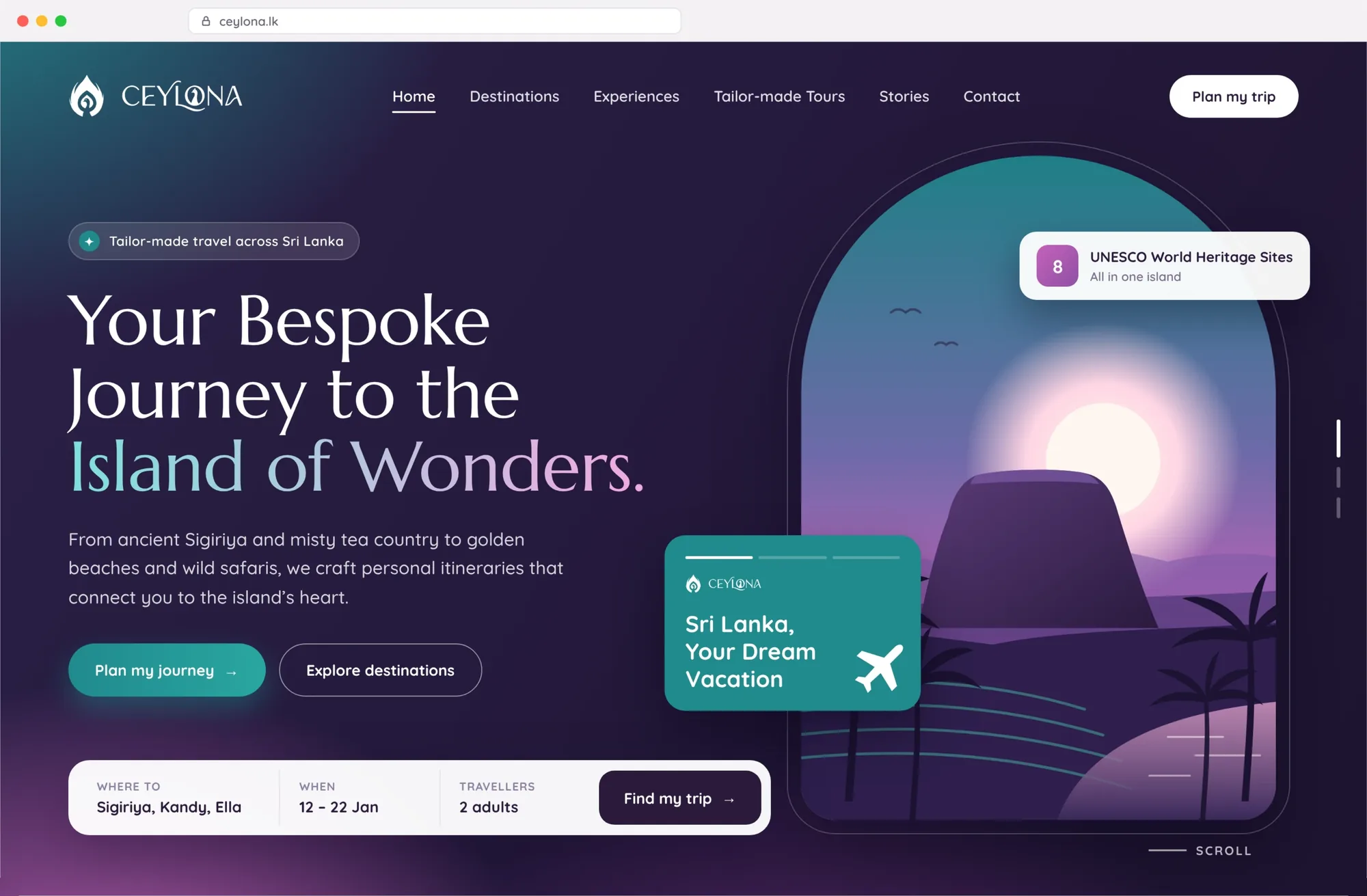
Ceylona website home section
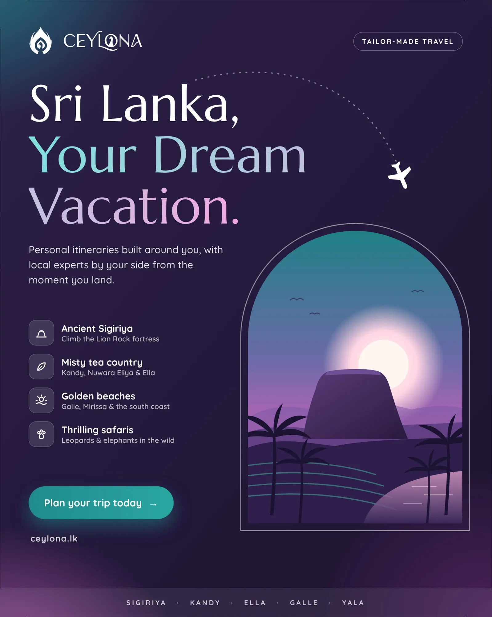
Ceylona social media advert
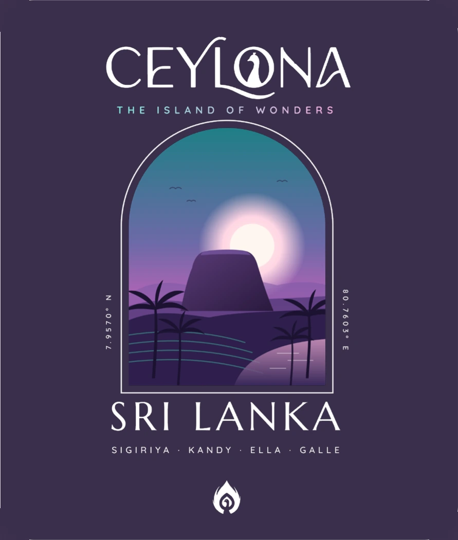
Ceylona T-shirt back print
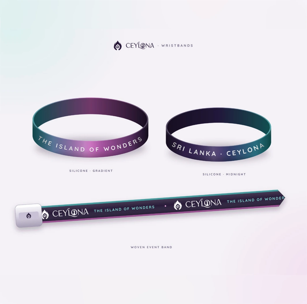
Ceylona wristbands
Ceylona T-shirt, front and back

KAGE Clothing

(Streetwear Brand Identity)

Project goal:

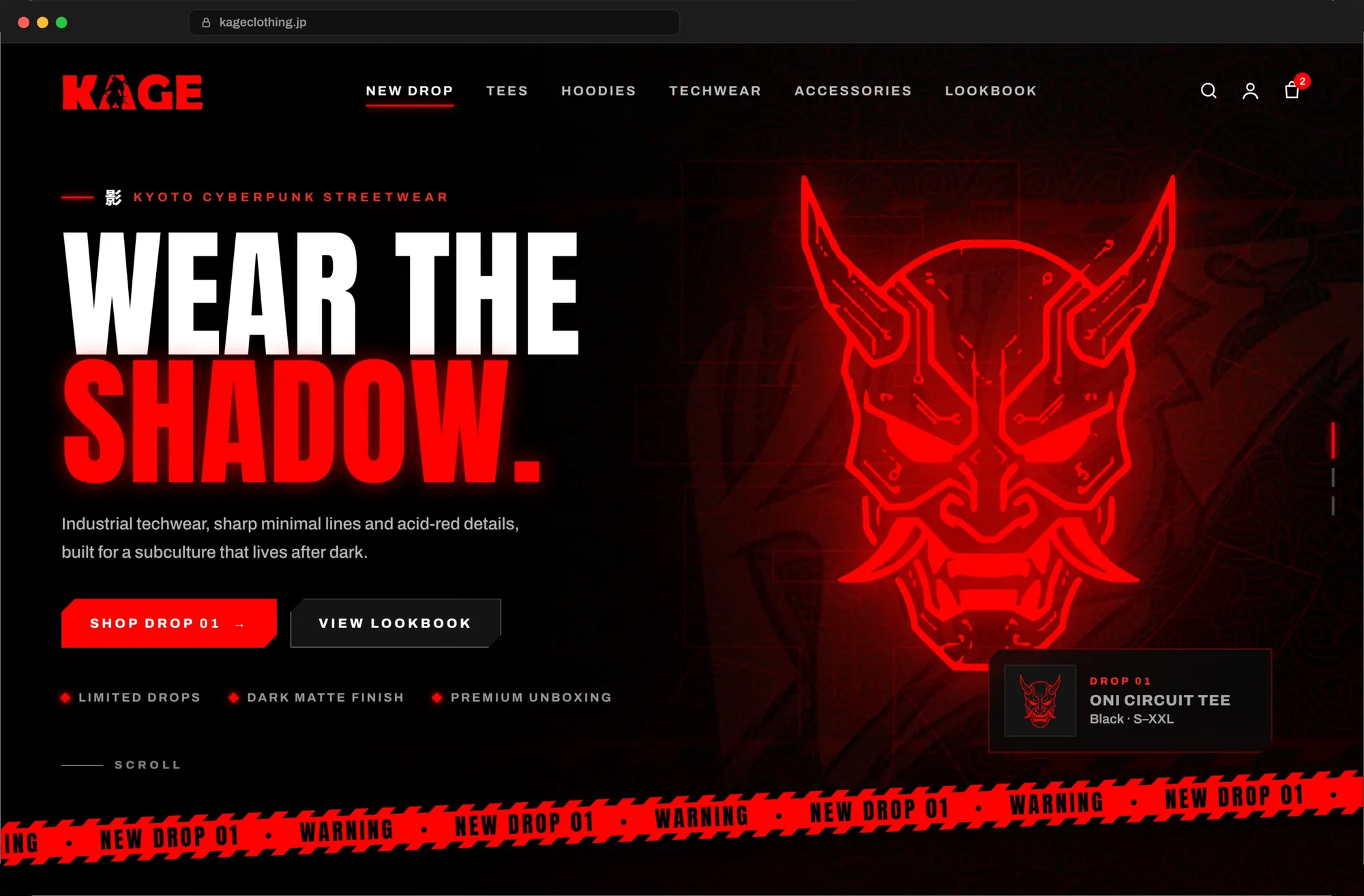
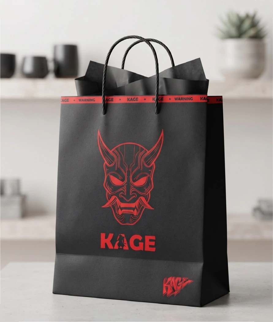
Create a bold identity for KAGE, a Kyoto cyberpunk streetwear label, that works across apparel, packaging, the online store and social media.

Design decision:

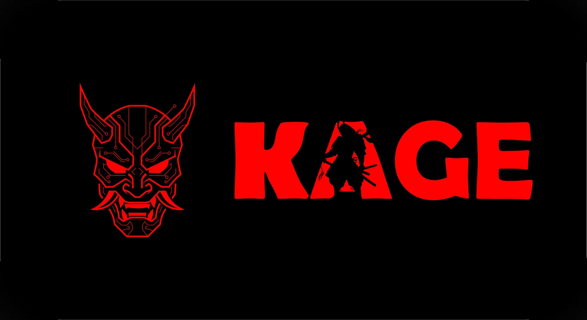
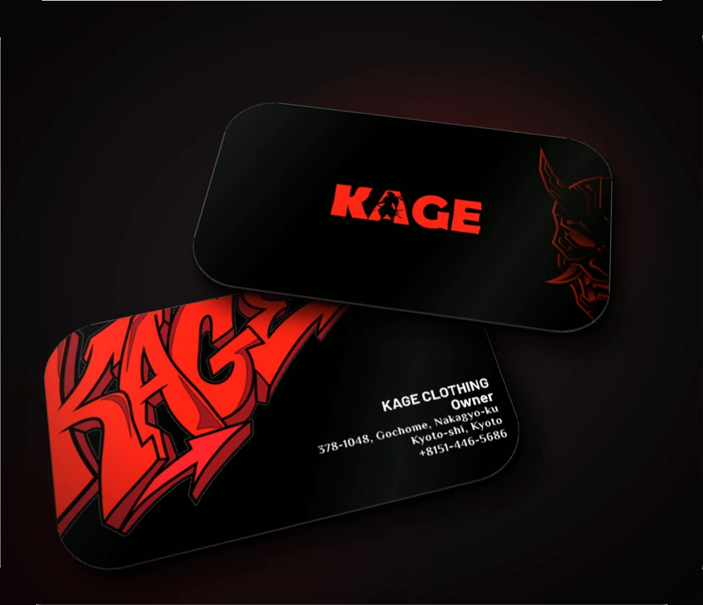
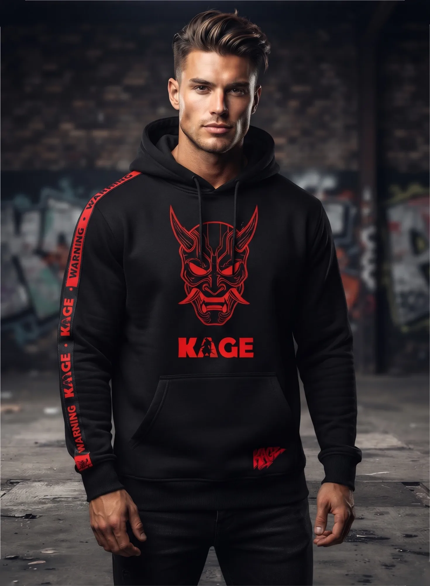
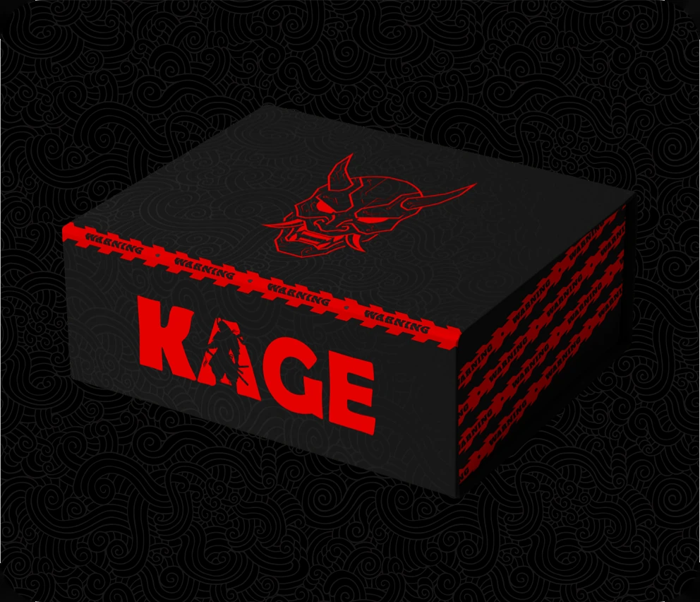
A circuit-traced oni mask and a wordmark with a samurai silhouette hidden in the “A” mix Japanese tradition with techwear edge. Pure red on black, warning-tape graphics and a swirling cloud pattern keep every piece loud, dark and instantly recognisable.

KAGE packaging box
KAGE business cards
Model wearing a KAGE hoodie
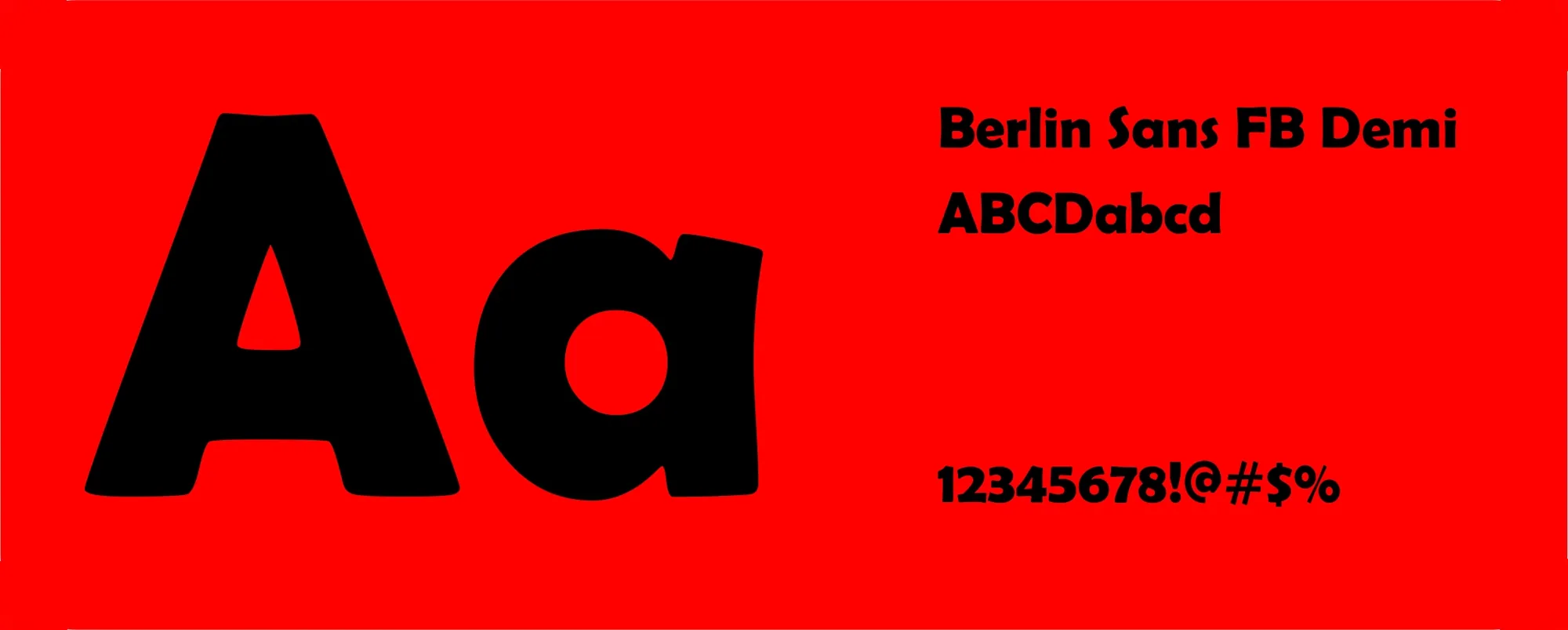
KAGE typography: Berlin Sans FB Demi
Red#FF0000Black#000000White#FFFFFF
KAGE website home section
KAGE shopping bag
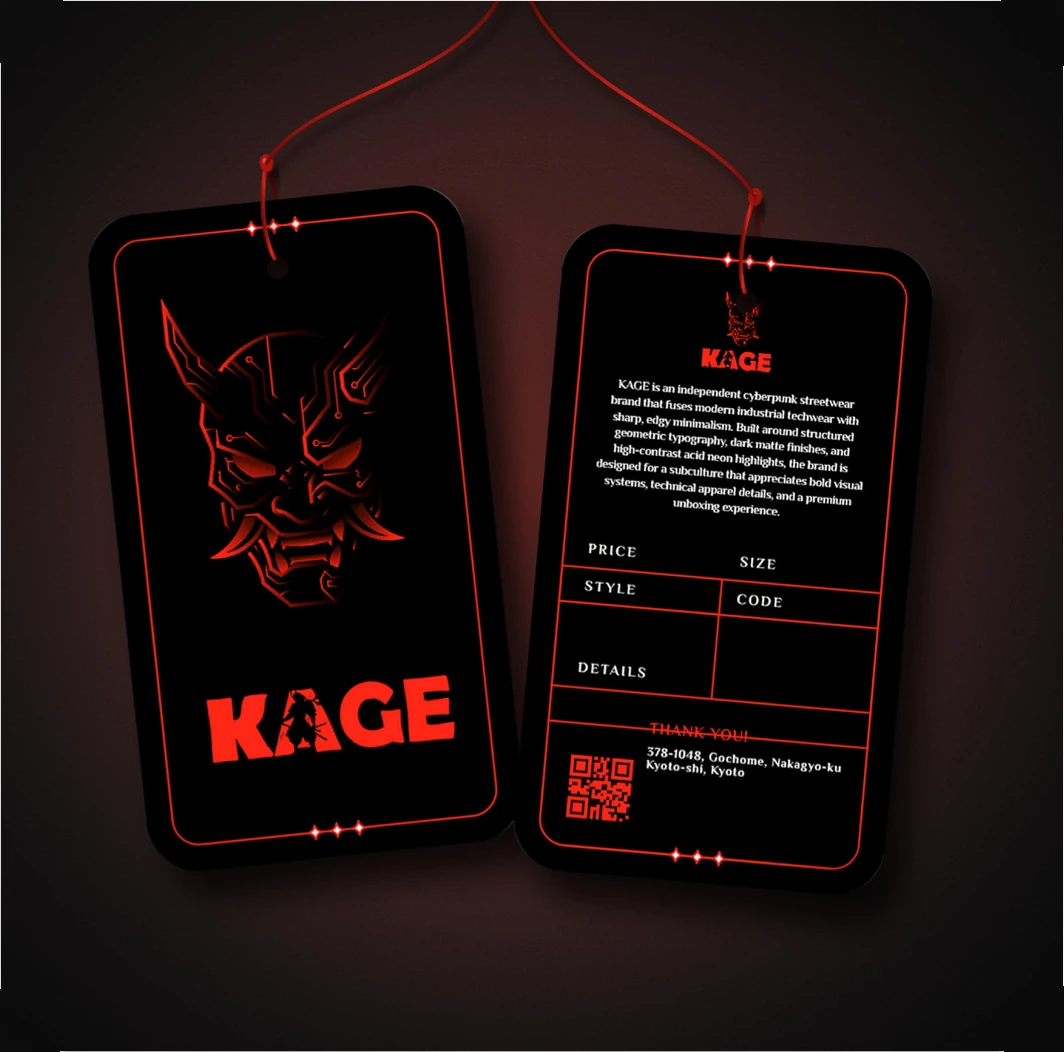
KAGE T-shirt tags
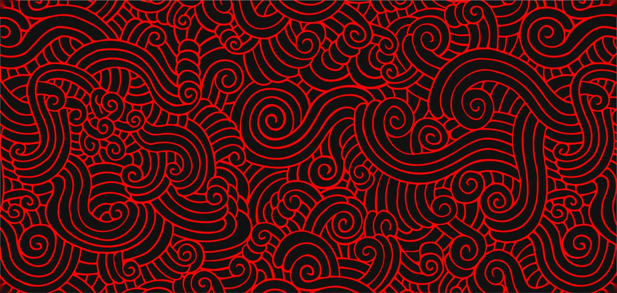
KAGE cloud pattern
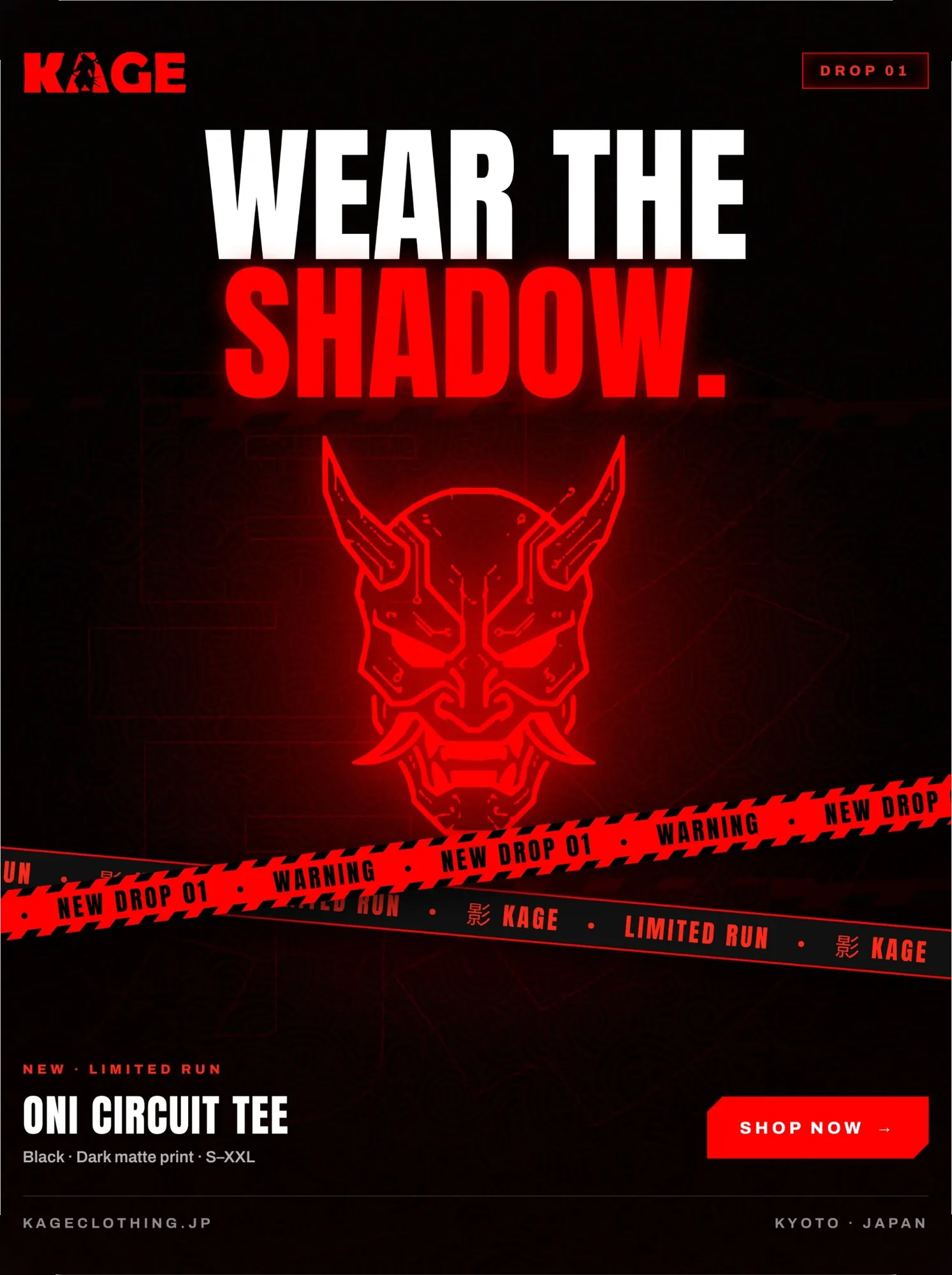
KAGE social media advert

Label Design

Updating soon

New Label Design projects are on their way. Check back soon.

Website Dev

RUGZY

(Custom Rug Store & Admin Panel)

Project goal:

Build an online store for RUGZY, a Sri Lankan hand-tufted rug studio, where customers design and order custom rugs, shop ready-made pieces and track their orders, with an admin panel to run the business.

Design decision:

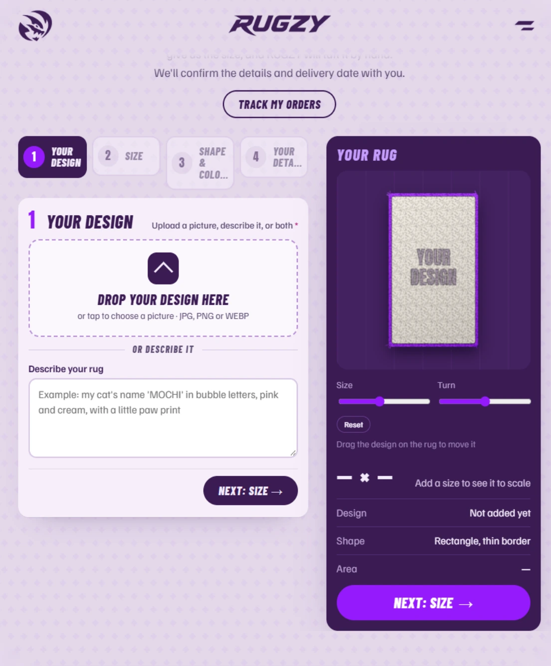
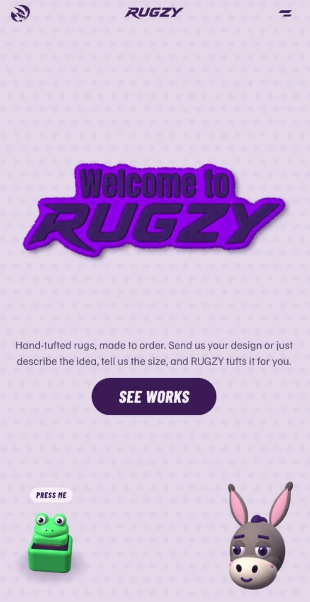
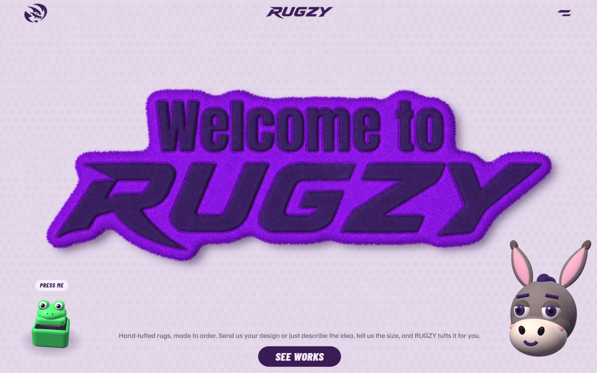
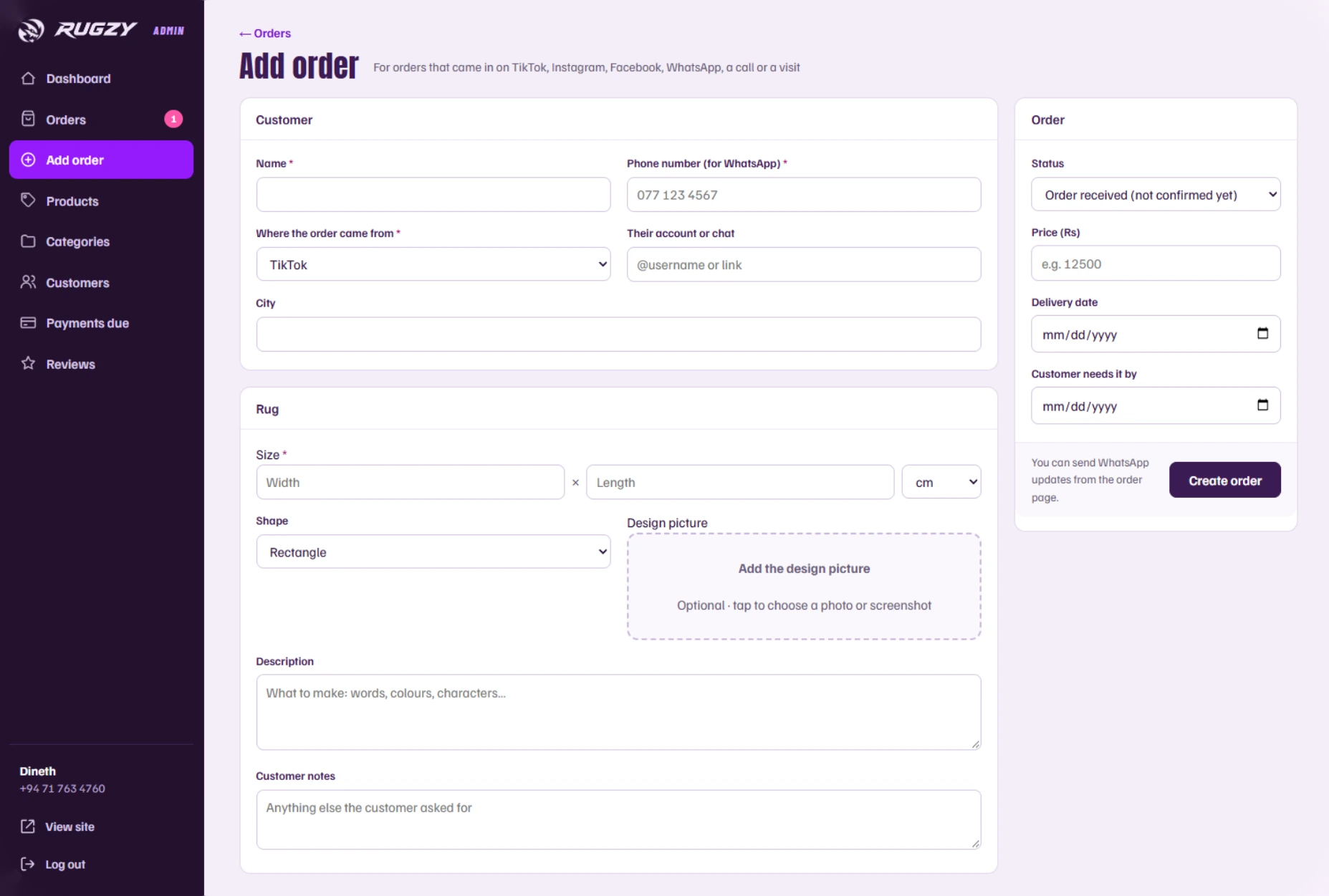
A 3D tufted-rug hero that reacts to the cursor makes the craft feel real from the first second, with a playful frog keycap and donkey mascot. A step-by-step rug builder turns any uploaded design into yarn colours, and a dark purple admin dashboard keeps orders, payments and customers in one place.

Make Your Rug design builder
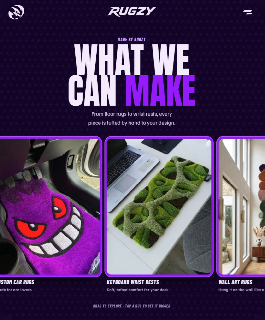
What We Can Make section
RUGZY home section on a phone
RUGZY home section with the 3D tufted rug
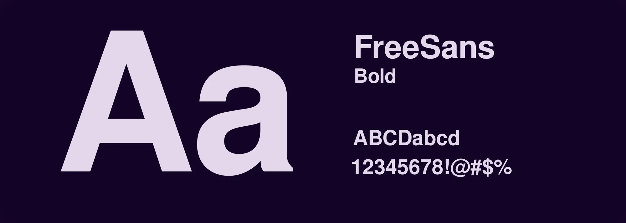
RUGZY typography: FreeSans Bold
Plum#3E2367Violet#7C13D2Lilac#E3D7EB
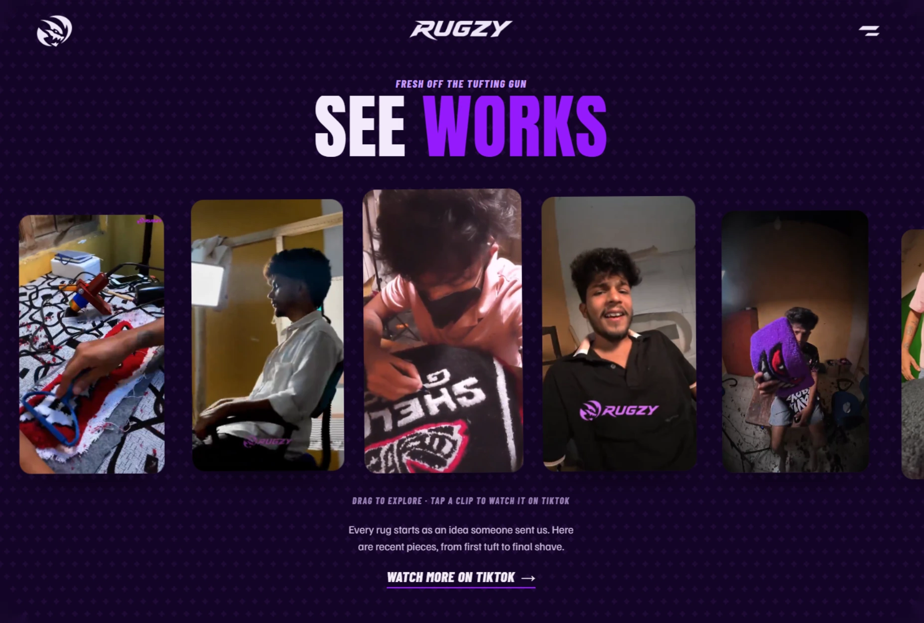
See Works video section
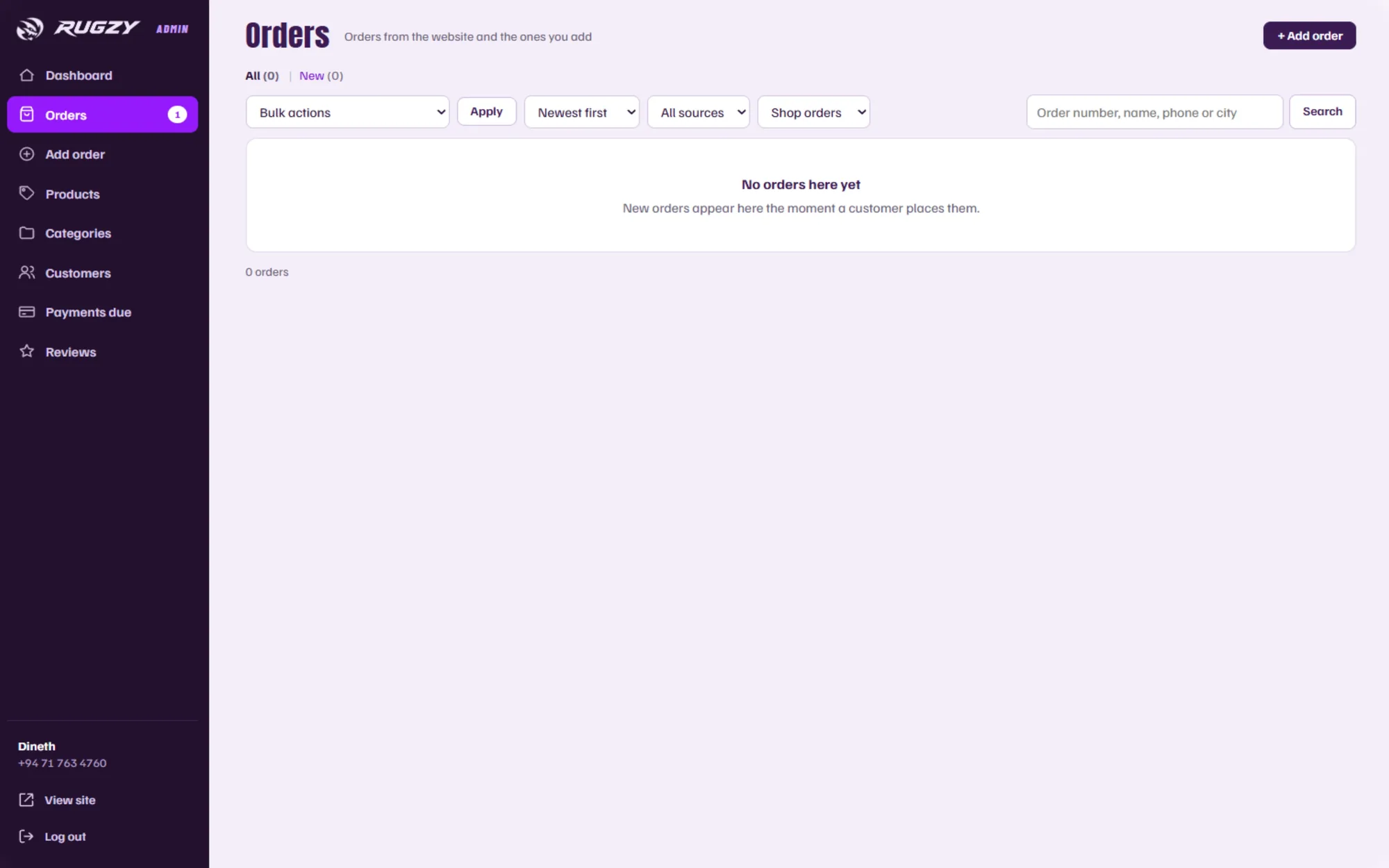
Admin panel: add order
Admin panel: orders dashboard

POS Dev

Updating soon

New POS Dev projects are on their way. Check back soon.

Social Media

Updating soon

New Social Media projects are on their way. Check back soon.

Posters & Flyers

Updating soon

New Posters & Flyers projects are on their way. Check back soon.

Thumbnails

Updating soon

New Thumbnails projects are on their way. Check back soon.

Let’s build yours next

Start a project